Category: Logos
-
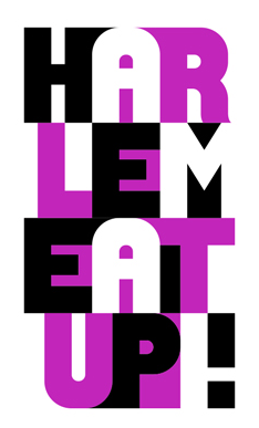
Harlem EatUp!
Modular branding system for Harlem EatUp! – designed by OCD.
-
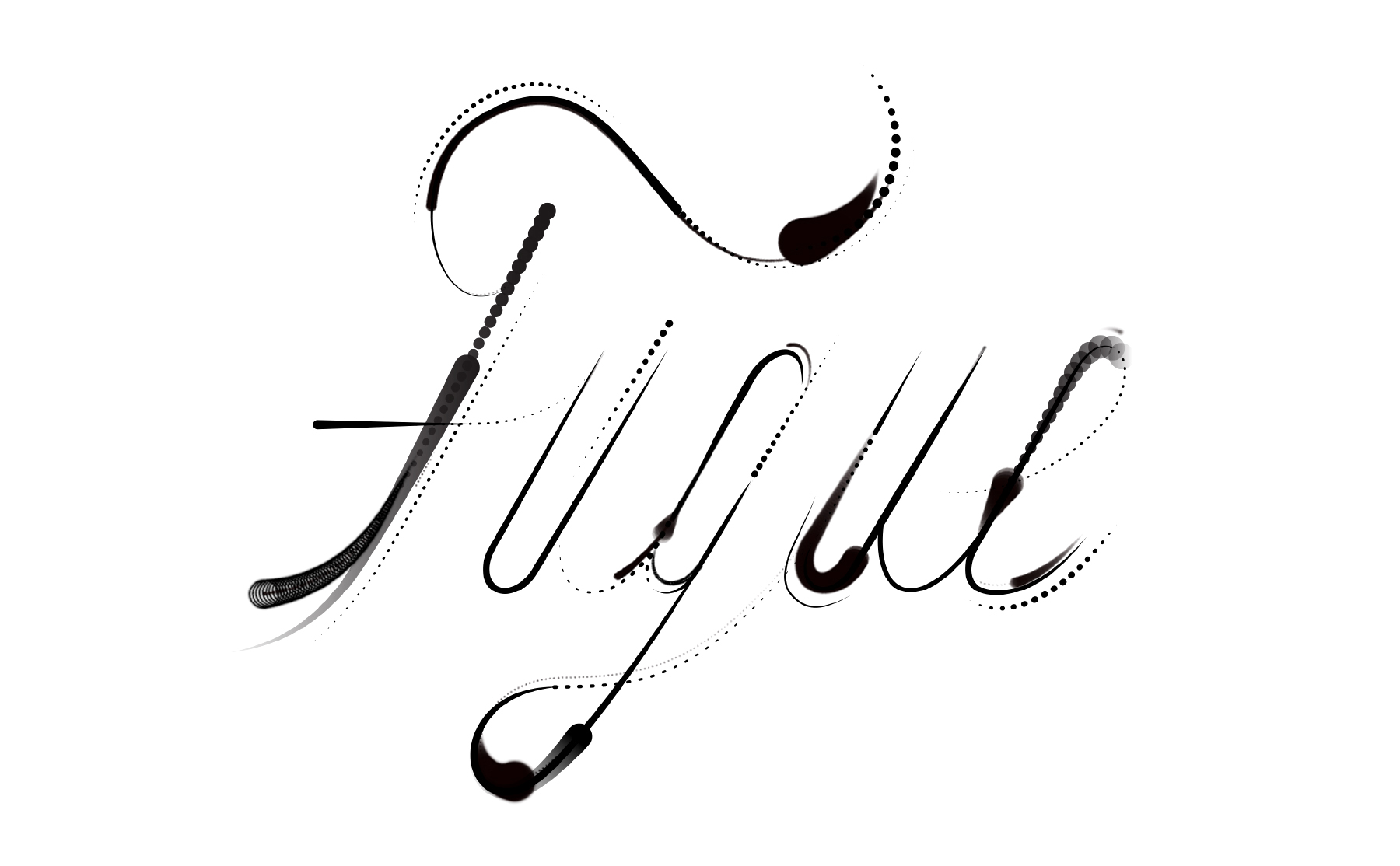
Fugue
Fugue identity by Sagmeister & Walsh. “Fugue wanted us to design a brand that visualized this ephemerality and embodied their core attributes of lineage and elegance. They also wanted the branding to depart from the typical “tech” graphics. Our logo works like the software does: it constantly regenerates itself while data […]
-
Girl Scouts
Refresh of the Girl Scouts of the USA branding by The Original Champions of Design.
-
Telgo
Telgo is a telecommunications company based in Brazil, offering broadband internet, dedicated circuit and fiber cable services. The identity was designed by BR/Bauen. “In the process of research and diagnosis, we identified what were the main challenges of the project: – Improve the perception of the company, because it was linked […]
-
Transavia
Transavia airline branding by Studio Dunbar. “The design is playful, accessible and flexible. A special feature is the application of icons to the underbelly of Transavia’s planes, with a different combination of icons for each plane in the fleet. Another symbolic livery feature appears next to the entrance, where the word ‘Welcome’ is written in […]
-
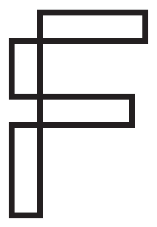
Fraher Architects
Freytag Anderson have rebranded Fraher Architects with this identity system based on the floor plan view of the letter F. “The intersecting compartments or rooms create a simple graphic device for containing text, images and texture.” – Freytag Anderson Spotted on It’s Nice That.
-
Prospect Park Alliance
‘The Original Champions of Design‘ (OCD) refreshed the branding for Prospect Park Alliance.
-
Bundle
Bundle are an Australian online retailer who provide maternity packs for parents to be. The branding was designed by The Company We Keep. “Developing the name Bundle to capture a sense of softness – a moment of tranquility and security amongst the frenzy of pregnancy and birth, whilst directly referencing the nature of the product. Touching […]
-
Yon
This great identity for Nastek’s Yon product line was completed by Saad in Brazil. “The project that originated the brand was supposed to fulfill a gap left by the competitors of the niche: none of them positioned their products in a personal, close or friendly manner. The chosen name, ‘Yon’, means distant but within sight. Short, direct […]
-
FitForm Apparel
We recently posted about Paul von Excite’s typography designs. But here’s a more detailed look at one of them for FitForm Apparel, an Australian based clothing company. Paul’s intention was to “create a lettered based logotype with a tight fontface and something unique with certain letters.”
-
Højmark Cycles
Højmark Cycles branding by Ineo Designlab.
-
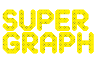
Supergraph
Supergraph, a new contemporary art and design fair run over 3 days in the Melbourne summer, was given a brand identity by A Friend of Mine “The yellow made for a fun and strongly colour coded event which carried through to the responsive website design, various print material and exhibition design including a 12 metre long yellow metal […]
-
Viva Pop Up
Viva Pop Up by Madrid based studio The Woork Co.
-
Climbit Apparel
Branding for a new outdoor apparel company specializing in climbing clothing. By Andrew Rogers in Vancouver.
-
Airbnb
New rebrand for Airbnb by DesignStudio. More information on the rebrand can be read on this Creative Review article and the DesignStudio case study.
-
The Chatsfield
BTL Brands have designed the identity for The Chatsfield – a fictional luxury hotel chain, and the setting for a new cross-platform romance series by publisher Harlequin/Mills & Boon. “We were given the enviable task of designing the identity for the hotel, building the website, and creating a series of luxury promotional products to be […]
-
Luxus
Branding for Luxus, a digital marketing agency, by Werklig. “We outlined following design drivers with Luxus: modern , multicultural , playful , colourful, energetic, human and fresh. First, their logo went through a redesign. Previous one was outdated, it lacked visual strength and weight. The new logo was designed to be able to stand out on its own. A […]
-
Navy Jerry’s
Navy Jerry’s Rum Bar and Restaurant in central Helsinki, designed by Werklig. “Digging deep in everything we found closely (or distantly) related to the naval and marine worlds, we designed a simple but strong visual identity that fit the concept of a naval rum bar with a new twist. From marine tattoos and sailors’ drinking […]
-
Cartisane
Geometric patterns create a beautiful identity system for Cartisane. Designed by French design agency Murmure. “Cartisane is a furniture upholsterer which wanted to extend its activities to interior design. This artisan has used Murmure to guide its image towards this direction by providing a feminine and contemporary visual identity. Drawing on its knowledge, and playing on […]
