Category: Logos
-

Zirimiri
A logo proposal for a new bar, found in the portfolio of Studio Thomas. The name ‘zirimiri’ represents the typical rain in the Basque country, delicate and elegant.
-

über
Designer: Fabio Ongarato Design Client: über
-
mcd
Designer:Â 3 fish in a tree Client:Â mcd
-
MariaLiv Industrial Design
Designer:Â Lundgren + Lindqvist Client:Â MariaLiv
-
The Barbershop
Designer:Â Here Design Client:Â The Barbershop Nice little identity for a music and sound design company called The Barbershop playing on the traditional barbershop red and white lines.
-
The Light
Designer:Â We Made This Client:Â The Light
-
Verve
Designer:Â Daniel Freytag Client: Vervebuild
-
Coco Republic
Designer:Â Daniel Freytag Client: Coco Republic
-
Bufete Alfonso López
Lawyers office corporate indentity. Designer: Folch Studio Client: Bufete Alfonso López
-

Blossom
Designer: Aled Williams Client: Blossom
-
Eaton Hall
As featured on the Communication Arts Exhibit, Eaton Hall commissioned Toronto’s Matter Strategic Design to work on their identity and welcome kit. As Matter describe it on their site ‘Elegance is not having to explain it’. Too true…
-
Mercado Central
Designer: Claudia Smith (Argentina) Client: Mercado Central Restaurant
-
Frog Capital
We really like the simple typographic treatment implemented on Frog Capital’s corporate identity, by London based L&CO. The black and white system was rolled out across everything from website to signage, stationery to printed collateral.
-

The Larder
Company have created this distinctive identity for The Larder, a modern British restaurant, bakery and delicatessen in London’s Clerkenwell district. Inspired by traditional British values, they used simple serif typeface, and a rich gold and deep aubergine colour scheme, which was supported by an ornamental pattern, to create a look that is classic yet contemporary. […]
-
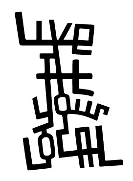
Live At Your Local
Company created this branding for Live At Your Local, an entertainment guide for London’s Islington and Hackney neighbourhoods, including a website and print applications. The concept behind the logo was… “Building on the core notion of local community, we designed the logo as a series of interconnecting streets, based on a map of the area.” […]
-
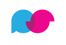
ParkSlide
Alan van Roemburg created this logo for  ParkSlide. The company: ParkSlide connects people via a web-delivered video conferencing system. The concept: The two intersecting discs are a typographic abstraction of the letters P & S, whilst at the same time the silhouettes create the shape of two people / faces connecting. You can view the project […]
-

Unit
Jenny Theolin over at Graphic Drip created the branding for Unit, a Swedish advertising agency. She gives the lowdown on the branding here: “The logo was designed to reflect various definitions of Unit: • An individual, group, structure, or other entity regarded as an elementary structural or functional constituent of a whole. • A group […]
-
The Andes Wine Experience
Logo for The Andes Wine Experience, created by Monoblock
-

Plancast
Alex over on the Iso50 blog, created this logo for Plancast – a website that helps your broadcast your upcoming plans to your friends. He’s also helpfully included a full run down on the development process in great details for everyone here to view, which helps explain the concept of the penguin in detail.
-

Lift
Nice little logo for Dallas bar, Lift. Designed by Banowetz + Company.