Author: Mikie
-
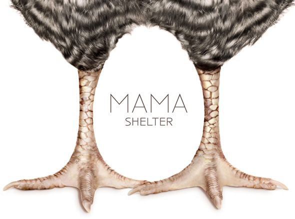
Mama Shelter
We love this identity for the amazing Mama Shelter hotels. The branding work was designed by GBH London. The following description was taken from GBH’s site: “…the Mama brand is positioned as an ‘affordable luxury’ hotel offering a unique mix of friendliness and communality, where guests sit together at large tables enjoying hearty food like […]
-

ITV
UK television channel ITV has recently released their rebrand. We love it and feel it’s a leap forward from their old identity which felt bland and lacked personality. It is versatile enough to work across different colour schemes and the relevant sub-channels. ITV’s in house ITV Creative worked with Rudd Studio and Fontsmith on the […]
-
Zito’s Sandwich Shoppe
Branding for Zito’s Sandwich Shoppe in Brooklyn, created by Tag Collective.
-
So Show Me
Theprintspace’s third So Show Me exhibition recently closed it’s doors for another sucessful year. The branding for the exhibition series was designed by Fridge Creative.
-

Campaign Monitor
The Campaign Monitor email newsletter system recently rebranded. Creating a clean icon mark (designed in-house) to be used in conjunction with a new typeface (designed by Anthony Lane).
-
Yume Umē
Playful identity for Yume Umē, a new Japanese Kitchen in Florida. Created by 160over90.
-
it’s Beds
Branding for it’s Beds, a bedroom furniture retailer, created by Flood.
-
ASJ Carpet Planners
Rebranding for ASJ Carpet Planners, created by Fridge Creative who also redesigned their website.
-

WebPlatform.org
A new resource called WebPlatform.org was launched this month. Setup in partnership between most of the web’s big boys including Apple, Facebook, Google, Microsoft and Adobe – it aims to provide a central place for information on web standards and how to use them.
-
Grid
Branding for GRID, new bi-monthly German magazine for 2D and 3D designers.
-
Gott’s Van & Car Service Centre
Branding for independent family run vehicle repair centre Gott’s Van & Car Service Centre, designed by Jordan Blyth Graphic Design. The logo mark uses the negative space within a letter ‘G’ to subtly refer to the companies nature of business by featuring a spanner/wrench device.
-
Best of Logoed 006: September 2012
Issue 006 of our newsletter is out. . You can view the newsletter here, and sign up here.
-
Rapha
The Rapha cycling brand, setup by two ex-Sapient design staffers. A good case study of the branding can be found on the Design Council’s website – although it strangely doesn’t actually show the branding work that it is talking about.
-
Wallspace
Salad Creative created this 3D styled logo for Wallspace, a full colour wall wrap system. “At our first meeting with the client, we quickly assessed that the new product should become a business in it’s own right. Alongside the brand development, we developed a marketing strategy to launch the business both to their existing customer […]
-

Motel
Brand identity designed by She Was Only for Shoreditch based photographic studio Motel. “Set in a Victorian railway arch dating from 1865, the studio asked for an identity which reflected the character of the local area.” “The logotype uses a customised typeface, and was applied to stationery, business cards, and signage. The project also included […]
-

Lyft
Playful branding for Lyft, a new car sharing service.
-
Alixx
Nice clean branding and packaging for Alixx, a scented candle brand, designed by Coast Design.
-
Los Logos 6
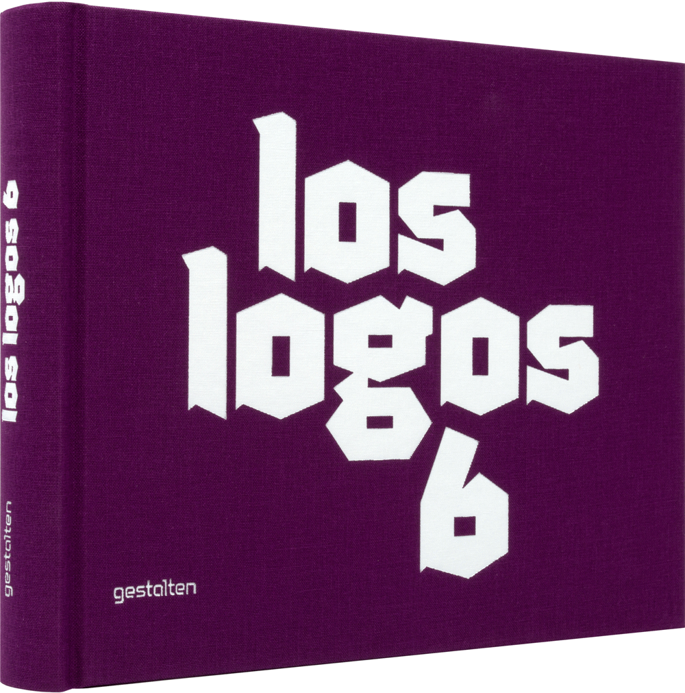
Purchase at Amazon USA › Purchase at Amazon UK › The latest update to the Los Logos series is now out, providing more quality logo inspiration. “Los Logos 6 is the authoritative reference on contemporary logo design worldwide. Like the previous editions of Gestalten’s best-selling Los Logos series, the book is both a guide to […]
-

Creative Space
“Creative Space is a brokerage firm who’s mission is to connect unconventional spaces to creative companies. The ‘creative spaces’ are reflected throughout the branding system — from their business cards to their website, playing with the idea of vacant space as a space to be filled.” The identity was designed by RoAndCo Studio, with photography […]
-
Nightworx
Identity by GWER for the Nightworx record label.