Author: Mikie
-
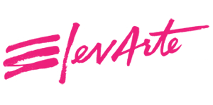
ElevArte Community Studio
Firebelly have an annual Grant for Good program, which awards a year’s worth of marketing, design and business planning services free of charge to a deserving non-profit organisation. This amazing program is not only doing good for the charity – but has produced some great results in terms of design materials. The winner of the […]
-
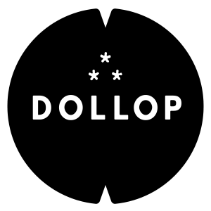
Dollop Coffee & Tea
“When Dollop decided to expand beyond their original northside mainstay to multiple locations across the city, they realized it was time to up their branding too. Firebelly designed an entirely new system for the coffee & tea provider. Beginning with the logo, we created a cohesive brand that would be adaptable to each of the […]
-
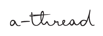
a-thread
Playful logo for women’s clothing online shop, a-thread. Logo for their blog too:
-

Metal
Branding for art organisation, Metal by Thompson Brand Partners.
-
Best of Logoed 007: September 2013
View the latest newsletter and sign up here ›
-
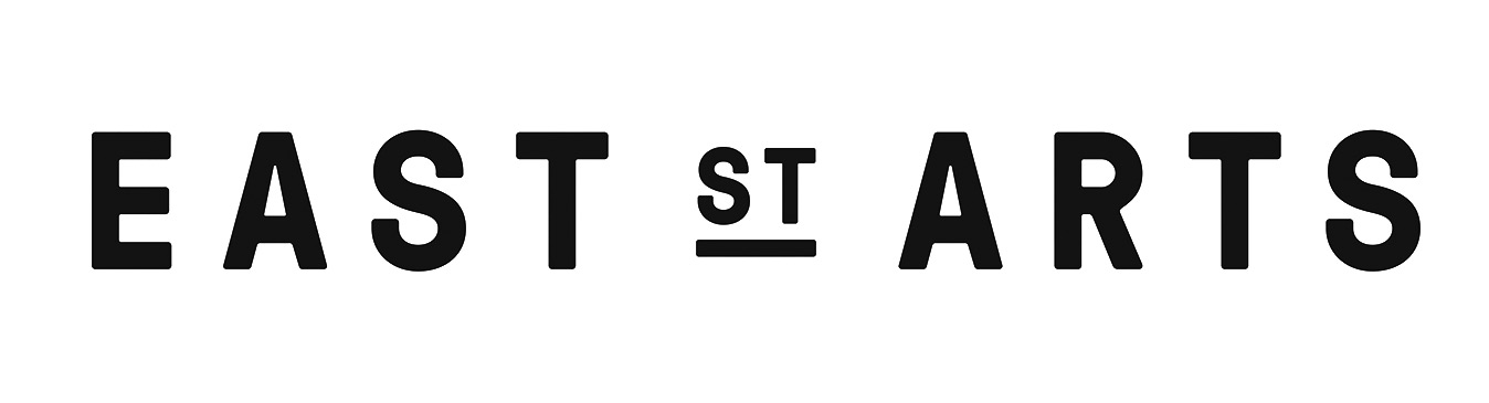
East Street Arts
As part of their 25th anniversary – East Street Arts, a national arts organisation has been rebranded by Thompson Brand Partners. The following information is from Thompson Brand Partners blog post… “East Street Arts is a national arts charity, which provides space for visual artists to grow and develop by providing support, mentoring, workspaces and making facilities […]
-
Broker Network
Broker Network branding by Thompson Brand Partners.
-

Designbolaget
Vibrant and original identity for Designbolaget by Lukas Muellner. Spotted on It’s Nice That
-
IOU
Studio Contents have designed this flexible brand identity for IOU: “IOU is an arts organisation with 37 years experience making original work across many art-forms. The company is recognised for their distinctive style. IOU’s work is renowned for the extraordinary and the bizarre with often surreal and fantastic narratives.” “We [Studio Contents] coordinated and hosted a […]
-
Insiders
Insiders is Sydney Opera House’s membership program, with branding work by Naughty Fish. The Naughty Fish website writes: “The assignment was to evolve the (Insiders) identity to meet the changing focus of the program and to represent the shifting perceptions around the SOH brand – most importantly that the House should be experienced, not just admired. […]
-
Stanley
Stanley, the established tools manufacturer, is rebranding with the help of Lippincott. Lippincott’s case study explains: “The new visual identity is grounded in Stanley’s rich heritage while simultaneously signaling the brand’s new direction. The new logo is more dynamic; it frees the Stanley name from its holding shape, yet maintains the ‘notch’ concept with an angular […]
-

Goal
Elmwood has recently completed a rebrand of football website Goal. “The aim was to create a timeless marque that would be a universally recognised symbol for Goal. It’s bold and simple, and the accompanying illustration style gives the brand a modern and confident personality.” says Simon Morrow, the Senior Designer on the project.
-

Efinity
A clever take on the usual infinity symbol. This is the branding for Efinity by Helen&Co. “Efinity is a software company behind Leadenhall.” “The challenge was to find a solution that would subtly correspond with Leadenhall’s identity, yet remain distinctive and unique.” “The symbol was designed with the Ledanhall’s hexagonal grid in mind, yet applying […]
-

Boom
Boom is the first brand designed from end to end by Blow. From brand strategy over naming, copywriting to identity design and all necessary collateral, including trade stands and video. Boom are a specialist media agency for everything social video.
-

100: A Century of Science
Branding for ‘100: A Century of Science’ by Ivan Colic, who produced the identity for OgilvyEarth to celebrate the centenary of Cape Town’s Kirstenbosch Botanical Gardens.
-
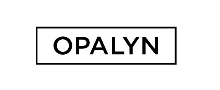
Opalyn
Branding for Opalyn, a fair trade jewellery brand. Designed by Anna Parellada.
-
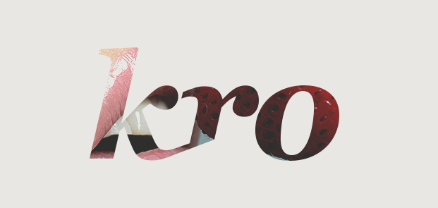
Kro
Branding for Kro, by WeLoveNoise. “The new marque & colour scheme was derived from the previous brand & altered to make the company look modern, but still have that element of distinction & history.”
-
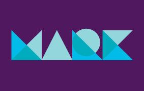
The Mark
Identity for The Mark, an apartments development in Sydney, Australia. Designed by Metropolis Inc.
-
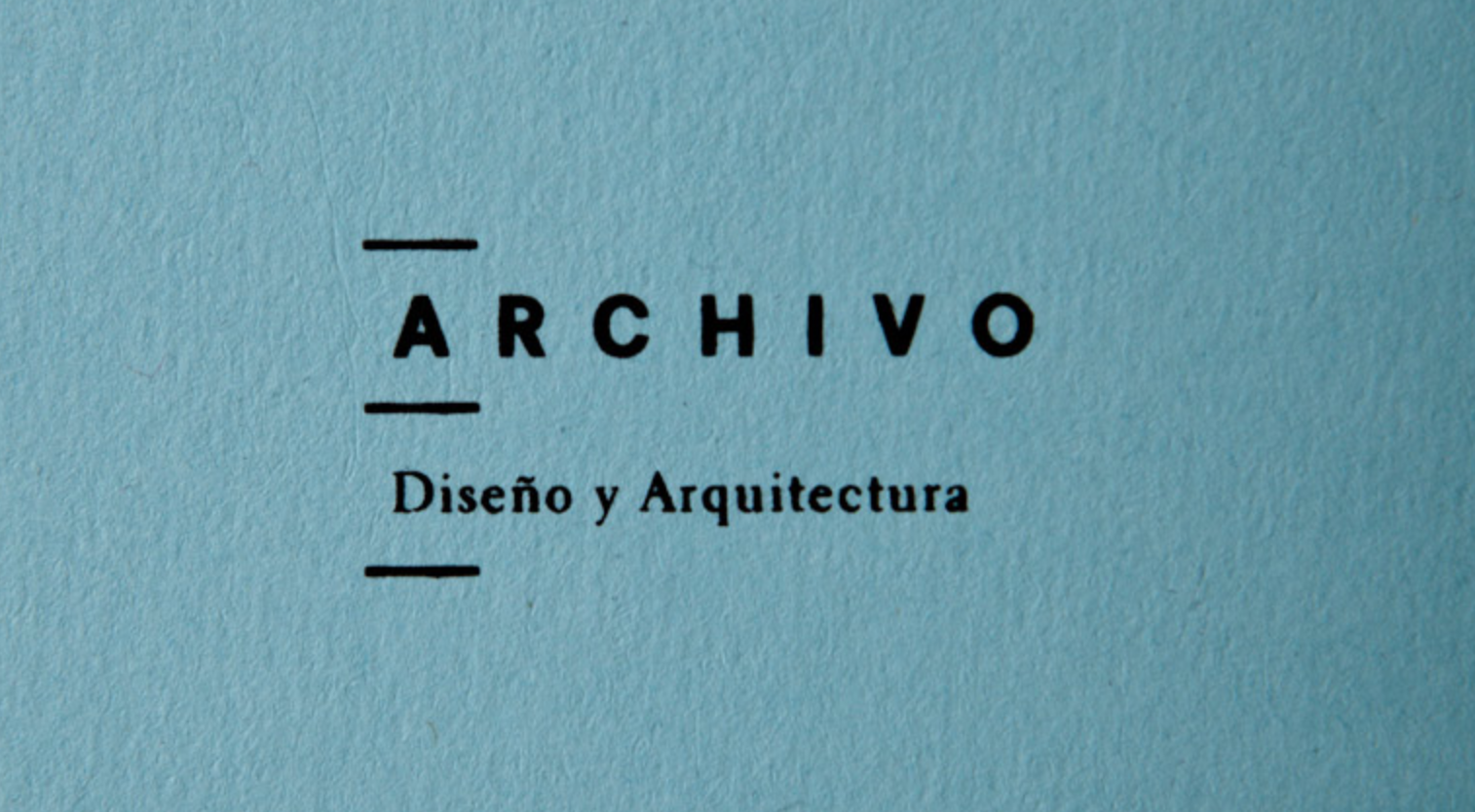
Archivoi
The Archivo institution dedicated is to the research, archive and the exhibition of design and architecture. Sociedad Anónima and S – Design Consultants collaborated in the creation of the concept and visual identity for this space and its activities.
-
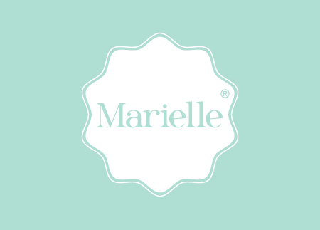
Marielle
Branding for Marielle; a coffee shop & bakery which offers home-made gourmet products and meals. Designed by Sociedad Anonima.