Author: Mikie
-

CBBC
New branding for the BBC’s CBBC tv channel. Stills from ident:
-
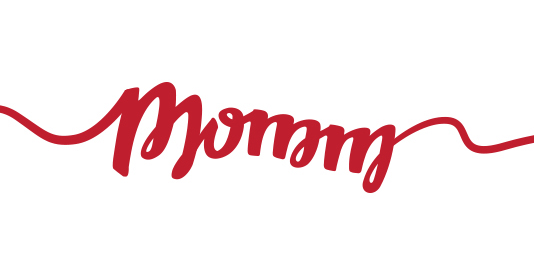
Momm
Branding for Brazilian agency Momm.
-
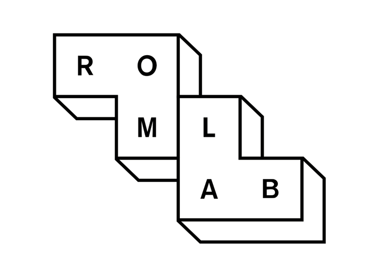
Romlab
Identity for Romlab by Bleed.
-
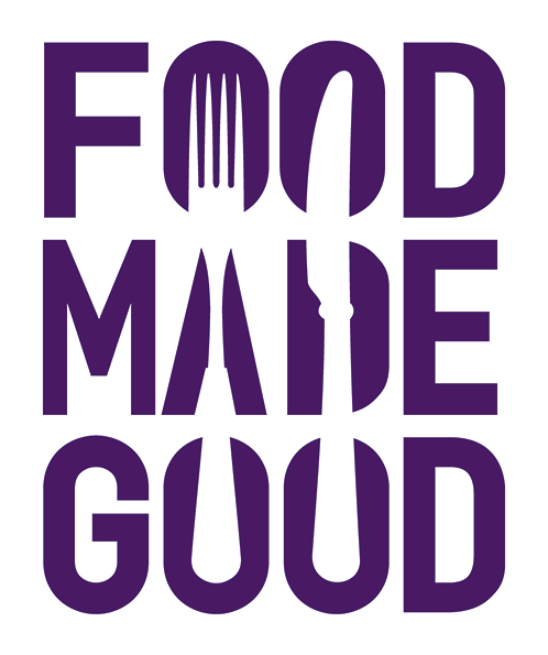
Food Made Good
Food Made Good is a sustainable food movement from the Sustainable Restaurant Association. Branding by Ave Design. “In the logo, negative space creates the illusion of cutlery shapes, representing the inseparability between the consumption of food and the organisation’s mission. The brand’s colour palette represents each of the food groups, as well as fresh ingredients.” – Ave […]
-
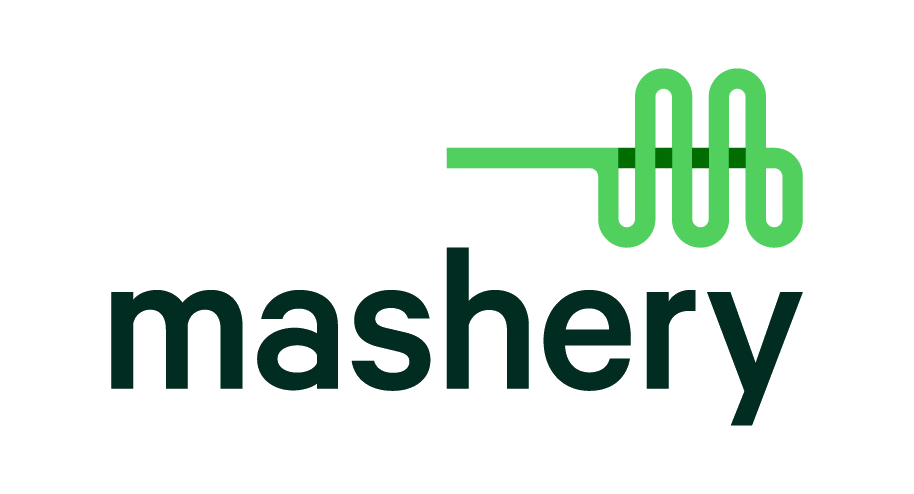
Mashery
Branding for Mashery management company by Nate Luetkehans. “Mashery wanted to reinvigorate their existing identity to help clarify their offerings and accurately reflect their internal spirit. We created a new visual system that conveys connectivity with a sense of whimsy.” – Nate Luetkehans
-
Steffi K
Singapore glass artist Steffi K branding by Zebra. “The curl within the letter K is a nod to glass blowing techniques as well as being representative of Steffi’s fluid working style.” – Zebra
-
Barcode
ANTI created an identity system for Norway’s new waterfront real-estate development. Originally spotted on It’s Nice That.
-

Gumtree
Gumtree have recently rebranded themselves using a new identity by design by Koto. “The previous incarnation of the logo was based in the brand’s founding story. We started with an open mind and explored both tree and non-tree solutions. It quickly became clear through consumer research that a tree was not just expected, but wanted as part […]
-
Union Hand-Roasted Coffee
Union Hand-Roasted Coffee is an independent small-batch roastery in East London. Studio Output developed their new brand identity. “To communicate quality and simplicity, we stripped the logo back to an elegant typographic device, with the ornamental ‘U’ representing the handle of an espresso cup. When contracted to a shorthand mark, this combines with the underline to […]
-
Per Aquum
Per Aquum branding by Eight.
-
Art of π
Art of π make handmade jewellery. The branding was designed by Anna Trympali.
-
Reys
Reys is a Chicken Restaurant in Cambridge UK, with branding designed by Elmwood. “The creative was founded on the key insight that Britons eat their way through an astounding 25 million chickens every week. But while Brits clearly love chicken, there’s one creature that loves it more – the fox!” – Elmwood “The brand name needed to reflect […]
-
Mono
Mono is a curated archive of scores and audio recordings from around the world. Designed by Nate Luetkehans. “We worked closely with Mono to create a brand that is scalable and adaptable across multiple experiences. The iconic ‘M’ monogram conveys kinetic motion by taking its inspiration from sound waves.” – Nate Luetkehans
-
Husler & Rose
Online furniture and homewares boutique Husler & Rose branding by Post. “Husler & Rose is an online boutique selling furniture, homewares and lifestyle pieces, born of a passion for objects that are thoughtfully designed, made with care and built to last using quality materials. We designed the brand identity and visual language with overlaid blocks […]
-
eir
Ireland’s largest telecoms company Eircom has been rebranded as eir by Moving Brands. “The new eir identity is dynamic and modern. It reflects our real ambition to become just that, a dynamic and progressive Irish organisation providing the high quality infrastructure and services the country needs and deserves. This is the logical next stage in our […]
-
Tilli
Tilli is a young and bold distillery with new and unique flavour combinations that offers a different approach to experience spirits. Designed by Weidemüller.
-

The Swan & Mallard
The Swan & Mallard Restaurant by John Randall. “The identity plays upon the three aspects of the restaurants name by unifying the swan and the mallard through the positive and negative space within the ampersand. A limited colour palette and minimalistic style helps create a simple yet balanced feel.” – John Randall
-
Simon Pengelly
Branding for British furniture designer Simon Pengelly. Designed by Spin. “The idea for Simon’s identity came from a visit to his workshop and noticing the lovely graphic stripes on the edge of the plywood used on one of his chairs. The various iterations of the marque reflect different thicknesses.” – Spin
-

Mauritshuis
Mauritshuis is a Museum in The Netherlands. Branding was completed by Studio Dumbar. “Inspired by artists’ monograms, the new logo overlaps reproductions of key paintings to communicate a clear link between the Mauritshuis and its collection. Supported by a contemporary wordmark, the logo hints at the museum’s heritage while placing it in the 21st century. […]
-

Lovoo
Brand identity for social networking app Lovoo.