Author: Mikie
-
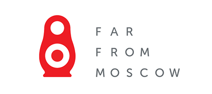
Far From Moscow
This identity for Far From Moscow created by Creasence, gives a nice nod towards both russian dolls and speakers. “Far from Moscow†is a resource designed to promote, catalog, and consider new music from Russia, Ukraine, and Belarus, together with the Baltic nations (Latvia, Lithuania, Estonia).
-
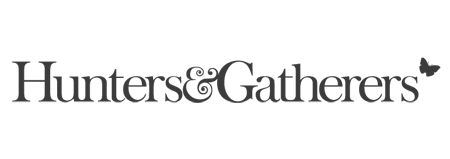
Hunters & Gatherers
Fridge Creative rebranded Hunters & Gatherers – an established fashion label based in London’s Shoreditch area.
-
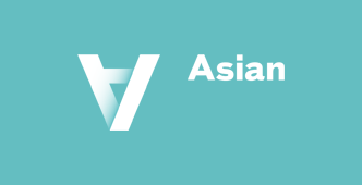
Asian Art Museum
New brand identity for the Asian Art Museum in San Francisco, was designed by Wolff Olins and features the bold use of the upside down A for all it’s brand materials.
-
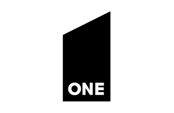
One
Logo and Brand identity for ONE GmbH, by Czech Republic based agency Creasence.
-
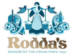
Rodda’s
Recently spotted on a trip to sunny Cornwall was this great brand for Rodda’s, makers of Cornish clotted cream. It was designed by Big Fish – their work folio is definitely worth a look!
-
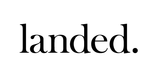
Landed
Identity for Landed, a network of landowners, promoters, investors and professionals involved in property developement and land promotion. The logo, brand materials and website all by Fridge Creative.
-
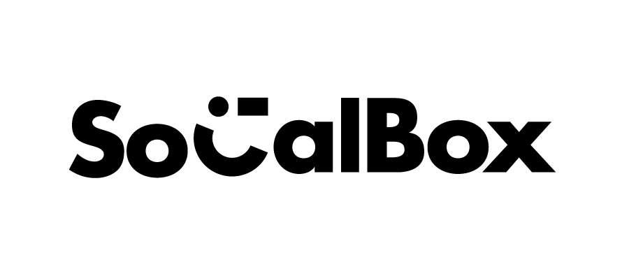
SocialBox
SocialBox logo by Sam Dallyn.
-
Best of Logoed 004: August 2011
Issue 004 of our monthly newsletter is out. . You can view the newsletter here, and sign up here.
-
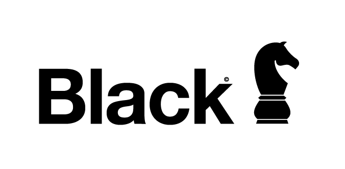
Black Knight
Another great identity by Sam Dallyn for Black Knight.
-
Best of Logoed 003: July 2011
Issue 003 of our new monthly best of newsletter went out this week. . You can view the newsletter here, and sign up here.
-
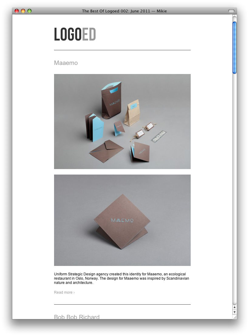
Best of Logoed 002: June 2011
Issue 002 of our new monthly best of newsletter went out this week. . You can view the newsletter here, and sign up here.
-
Logoed Rebrand
We’ve had a bit of a refresh of our own Logoed branding over the last week! The new branding is aimed at allowing the website to be a platform that allows the work of the featured brands to stand out. By stripping back the colour scheme and revising the logotype to it’s lovely new font, the […]
-
Monthly Newsletter
At the beginning of the month, we sent out the first in the series of our pick of the month emailers. . You can view the first issue here. . And if you’d like to sign for this monthly email – you can do so here.
-
Alerion
Francis Drake designed this identity, based on a basic flag symbol, for Czech flag producer Alerion.
-
Mayo Surf Co.
Danger Brain designed this logo and supporting branding identity for Mayo Surf Co.
-
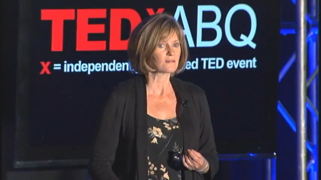
TEDx Talk – The Nature of Symbols
Maggie Macnab recently got in touch to let us know of her TEDxABQ talk she recently gave titled ‘The Nature of Symbols’. She examines how creative problem-solving correlates human visual expression with nature’s process. You can view the video here. Maggie’s work has been recognized by Communication Arts, Print, Step by Step, the American Ad […]
-
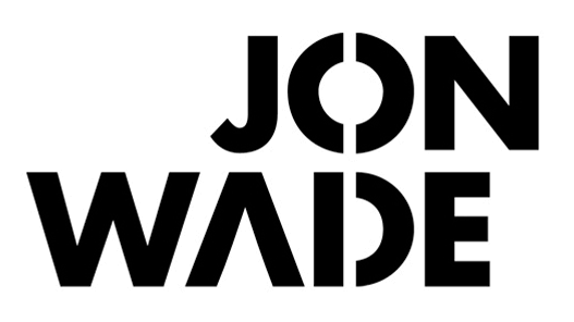
John Wade
Another identity by Sam Dallyn – this one for John Wade works well when shown in use on their brand materials, as shown below.
-
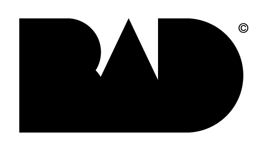
BAD
Second piece of work from Sam Dallyn‘s great portfolio is BAD.
-
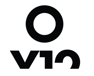
OV12
This is the first in a series of great identity work by Sam Dallyn, who is a UK based designer. First up we have OV12…
-
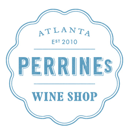
Perrine’s Wine Shop
This branding for Perrine’s Wine Shop based in Atlanta was designed by Alvin Diec.