Author: Mikie
-

Canaby
The colourful identity for Carnaby, the area in London famous for Carnaby Street. View the ‘Carnaby Essential Guide’ booklet here.
-
Ruw Meubelen
Identity by GWER for Ruw Meubelen, a company which makes furniture out of used wood. The stationary is stamped on recycled paper.
-
Silver Island
Creasence designed the logo, corporate style and packaging design for Silver Island, a fashion jewellery and accessories brand.
-
Lore
Lore, who were previously called Coursekit relaunched with this bold new identity. You can view the thought process behind the design here.
-
Quipsologies
The logo for Under Consideration’s Quipsologies website, makes use of a custom drawn Q and the Gotham typeface.
-

Google Play
Google’s new apps/music/books store Google Play, gets a rather nice treatment – they’ve managed to refrain from the usual garish bright colours to create this design.
-
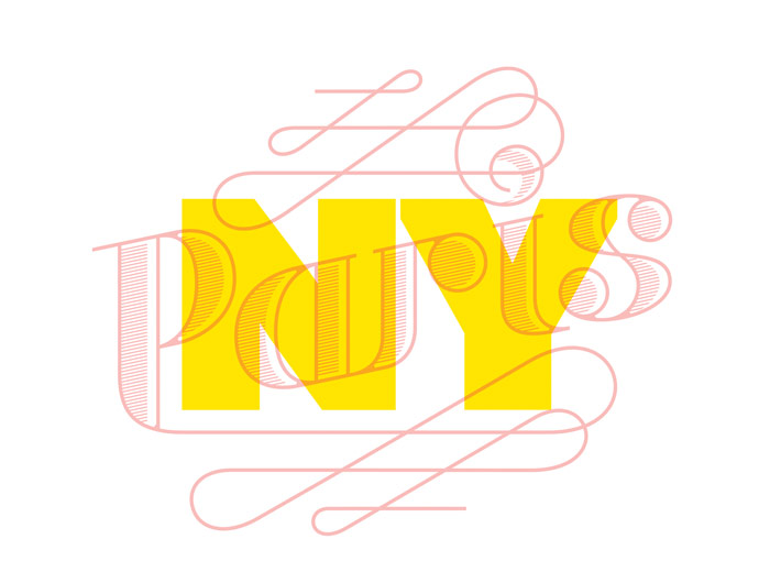
La Vittoria: Paris – New York
A lovely and playful duel identity for the La Vittoria: Paris – New York charity event by lg2boutique.
-
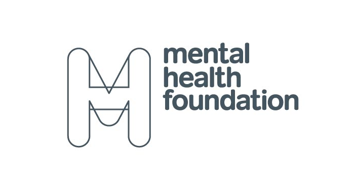
Mental Health Foundation
Branding for Mental Health Foundation by SEA Design. Combining the M and the H to represent the lack of clarity that people make with mental health issues may experience.
-

Tom Hull
Great identity for photographer Tom Hull by Rosie Lee.
-
Lark
Recently spotted on Creative Review was this brand work by ASHA for Lark.
-
Alva
Clean stylish typeface for Alva by Marta Montagut Mor.
-

The Royal Danish Academy of Fine Arts, Schools of Architecture, Design and Conservation
This identity created by Daniel Siim, for the The Royal Danish Academy of Fine Arts, Schools of Architecture, Design and Conservation uses the different disciplines as separate brand elements that come together to form the complete logo.
-
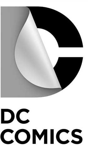
DC Comics
DC Comics have revamped their brand with help from Landor Associates. As explained on the DC Comics blog, “the design of the new DC Entertainment identity uses a “peel†effect – the D is strategically placed over the C with the upper right-hand portion of the D peeling back to unveil the hidden C – symbolizing […]
-
Best of Logoed 005: January 2012
Issue 005 of our monthly newsletter is out. . You can view the newsletter here, and sign up here.
-
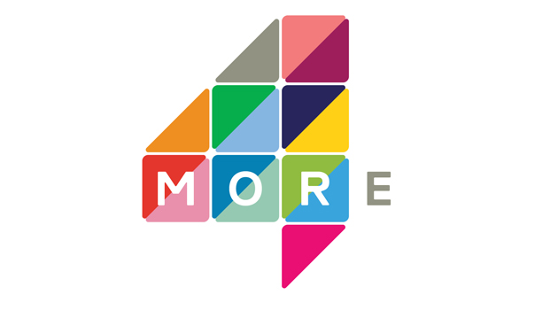
More4
The UK television channel More4 has just relauched with this fresh new identity created by ManvsMachine. “The re-brand is centred round a bold, flexible logo that morphs through a series of flips, folds and reveals. The colour palette reflects the vibrant nature of interiors, food culture, fashion and other contemporary lifestyle programming.” “Live-action idents see the […]
-
Capital Kitchen
Capital Kitchen’s brand and graphics were created by Cornwell. Cornwell created its brand identity for this Melbourne homewards and food concept store in the style of a modern farmhouse. Illustrations mix a variety of nostalgic food items – like milk bottle, egg cups and preserve jars – to evoke a time when things were slower.
-
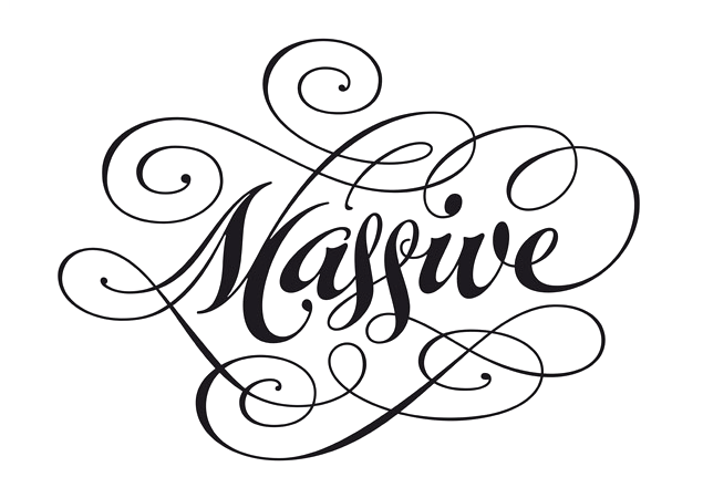
Massive
Playful logo for Massive by Root. This is Root’s description of the project: “Massive devise and produce extravagant parties, launches and events for private clients and global corporations. The brief was to create a distinctive brand that encompassed the flamboyant personality of the Partners and reflect the personality of the Company delivering a message of […]
-
Whyte Lilja
Whyte Lilja are Stockholm based architects with focus on Interior Concepts for experience driven commercial spaces. Full scale Interior Architecture for private villas. This identity was designed by Kurppa Hosk.
-

Villa
Nice logo by Kurppa Hosk for Villa, a temporary pop-up store.
-

Retroflo
Clever identity by Sarah Walsh for Retroflo, an innovative yet simple piece of software used by waste management sites to detect blockages and keep things flowing through the pipe network.