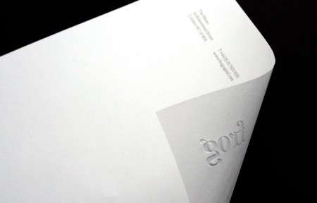
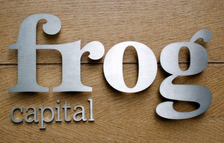
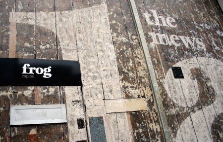
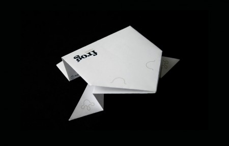
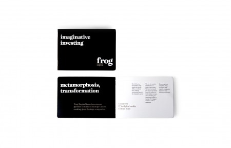
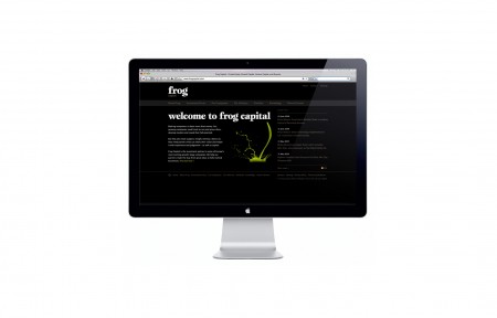
We really like the simple typographic treatment implemented on Frog Capital’s corporate identity, by London based L&CO. The black and white system was rolled out across everything from website to signage, stationery to printed collateral.
We really like the simple typographic treatment implemented on Frog Capital’s corporate identity, by London based L&CO. The black and white system was rolled out across everything from website to signage, stationery to printed collateral.


by
Tags:
Leave a Reply