Branding for Luxus, a digital marketing agency, by Werklig.
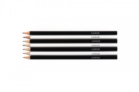
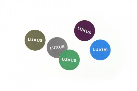
“We outlined following design drivers with Luxus: modern , multicultural , playful , colourful, energetic, human and fresh.
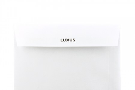
First, their logo went through a redesign. Previous one was outdated, it lacked visual strength and weight. The new logo was designed to be able to stand out on its own. A bolder and more compact solution would add personality and improve visibility.
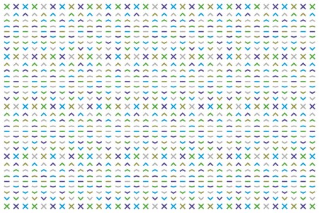
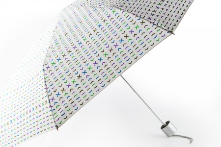
To create more playfulness and personal vibe, we then created a Luxus pattern. It was designed to be used as a visual spice and only on limited applications. And finally—to support all this—a solid and consistent system for typography was created for all media channels.” – Werklig case study
Leave a Reply