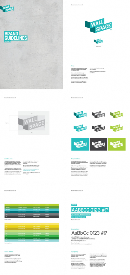
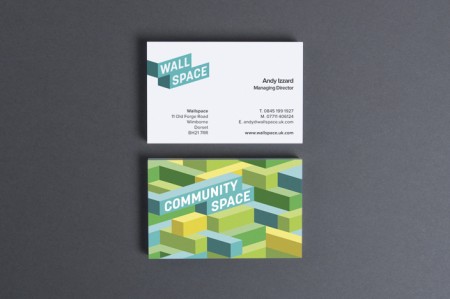
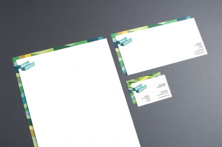
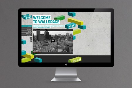
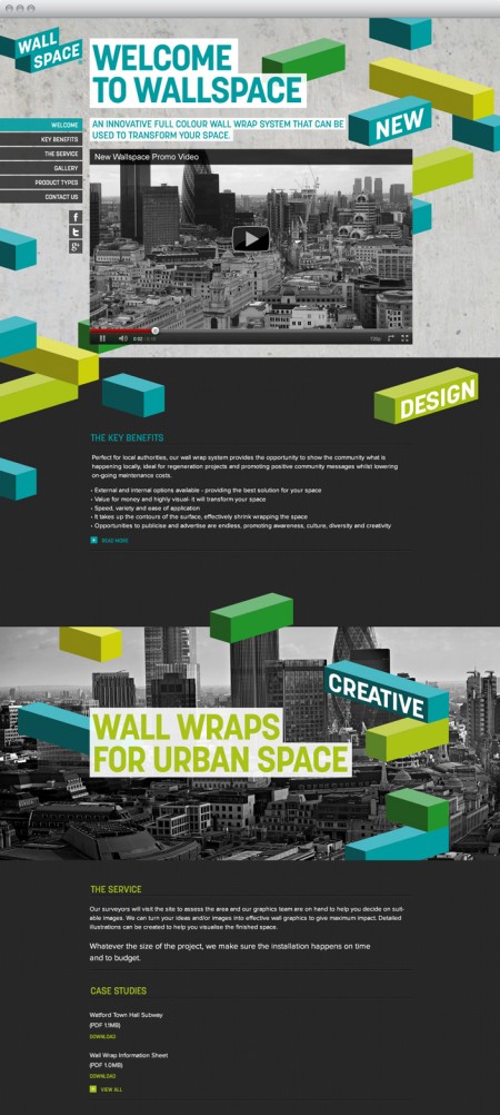
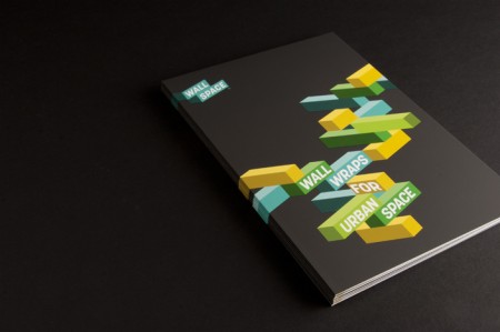
Salad Creative created this 3D styled logo for Wallspace, a full colour wall wrap system.
“At our first meeting with the client, we quickly assessed that the new product should become a business in it’s own right. Alongside the brand development, we developed a marketing strategy to launch the business both to their existing customer base and into a wealth of new markets we discovered during our planning process. We also applied for and registered their trademarks, which provides suitable protection over the name, products and services.”
“With an existing business specialising in anti-graffiti and urban maintenance services, this client came to us for ideas to help launch a new ‘wall wrapping’ product. From the outset, we wanted to create a name and brand language that was indicative of the product itself together with the environment it was designed to be used in. After careful consideration and exstensive research (and wrap based names), it was decided that Wallspace® ticked all the boxes. The name was flexible enough that we could couple the suffix ‘space’ with a variety of key adjectives to describe both the product and the service offering.”
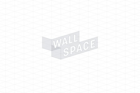
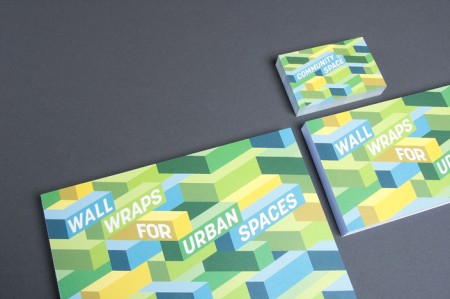
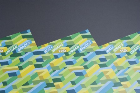
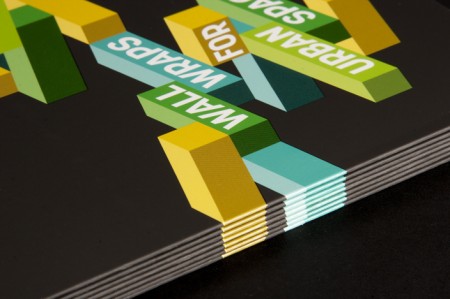
“The isometric grid based logo and pattern allowed us to demonstrate the potentially colourful and versatile nature of the material and gave us the perfect medium through which to communicate brand messages and personality.”

Leave a Reply