
Ident for band Delphic.
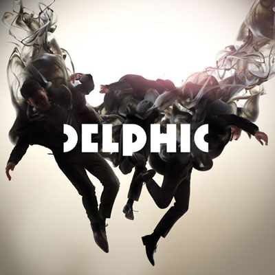
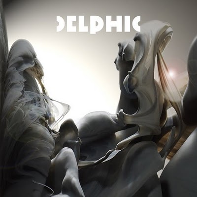
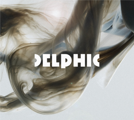
The album/singles sleeve artworks produced by Non-Format is also equally fantastic, with photography by themselves & Jake Walters…
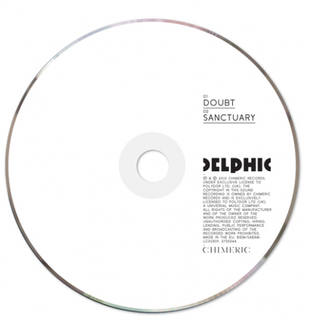

Ident for band Delphic.
The album/singles sleeve artworks produced by Non-Format is also equally fantastic, with photography by themselves & Jake Walters…


by
Tags:
The bold typography within the logo has a powerful presence. Thank you for sharing.
typo is cool as concept.but i dont like the E, its like C.
thanks.
nice perspective of this type of fonts!
ta refeo, mija hace unos mas bonitos y eso que ta en el kinder la wey
I agree with “DesignTheatre ” about “E” and this kind of font is very similar to “PHILIPS’s logo” but i love that CD , its very simple and nice, and i like photos and i think it is ink in water , may be! i love it 🙂
Leave a Reply