Comedy Feast

Screen Shot 2018-02-12 at 10.24.24 copy

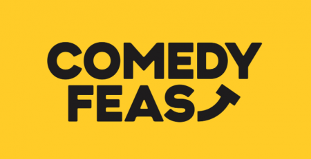
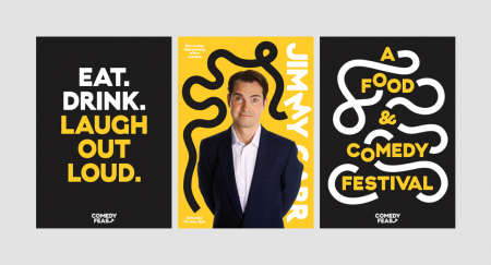
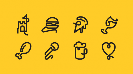
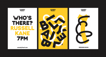
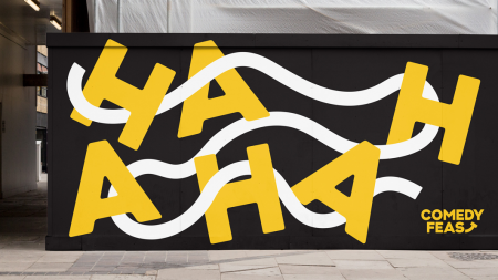
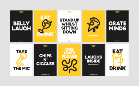
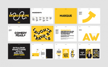
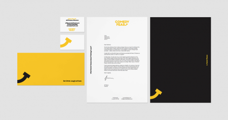
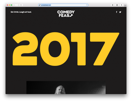
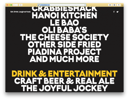
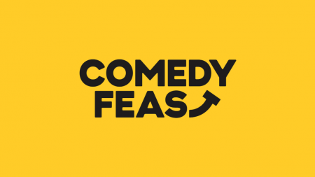
Great branding for Comedy Feast by Only Studio.

Screen Shot 2018-02-12 at 10.24.33Screen Shot 2018-02-12 at 10.24.39Screen Shot 2018-02-12 at 10.24.47Comedy_Feast_LocationsScreen Shot 2018-02-12 at 10.25.22Screen Shot 2018-02-12 at 10.25.31Screen Shot 2018-02-12 at 10.25.39Screen Shot 2018-02-12 at 10.25.54Screen Shot 2018-02-12 at 10.26.00

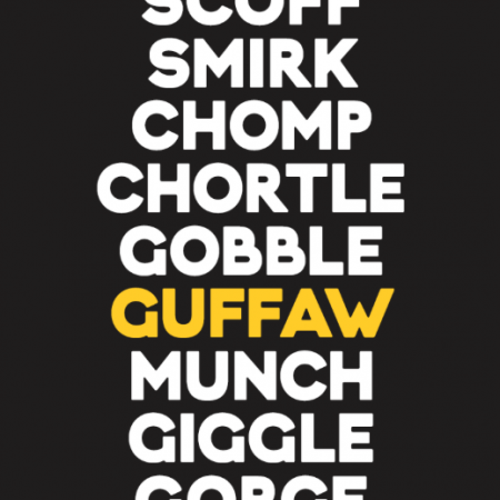
“The brand employs a simple graphic line to invoke the spirit of comedy, playfully interacting with photography and type as it moves between locations. Across print and digital, a stripped back colour palette builds familiarity as the festival works to establish itself. The brand’s tone of voice promotes a warm and mischievous character in support of the event’s eclectic offering for adults and families.”Only Studio

Screen Shot 2018-02-12 at 10.28.36Screen Shot 2018-02-12 at 10.28.45Screen Shot 2018-02-12 at 10.24.24


Posted

in

by

Tags:

Comments

3 responses to “Comedy Feast”

  1. BadDesigner Feast Avatar
    BadDesigner Feast

    This is just… not done well. I’ve been staring at the t for a while, and I still don’t get it. The whole thing is a bowl?

  2. Mikie Avatar
    Mikie

    I’m assuming this is just trolling? As it’s clearly a stylised T to make a smile… I personally love it.

Leave a Reply

Your email address will not be published. Required fields are marked *