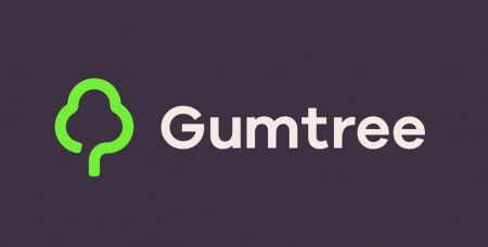
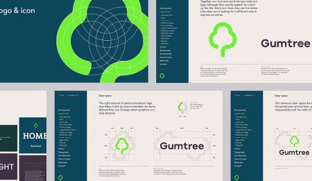
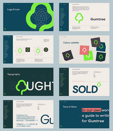
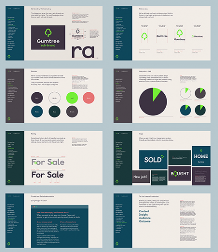
Gumtree have recently rebranded themselves using a new identity by design by Koto.
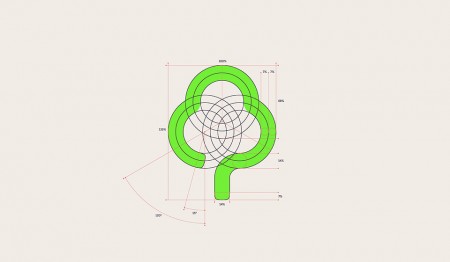
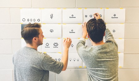
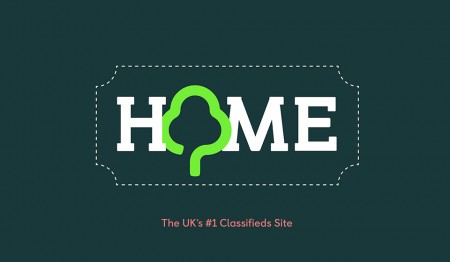
“The previous incarnation of the logo was based in the brand’s founding story. We started with an open mind and explored both tree and non-tree solutions. It quickly became clear through consumer research that a tree was not just expected, but wanted as part of the brand. We created a new simpler tree to make it more ownable, keeping all the positive natural connotations of growth, stability and diversity whilst making an instantly recognisable icon.” – Koto
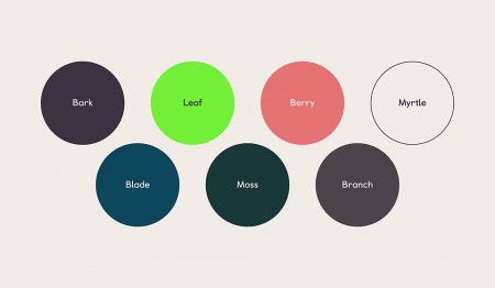
“There are a lot of brands operating in the technology sector with poppy primary colour palettes. Here there was an opportunity for a bright natural green, an evolution of the previous colour, to catch people’s attention. We set this vibrant green against a unique darker palette inspired by the Rainbow Eucalyptus tree and its unique multi-hued bark.” – Koto
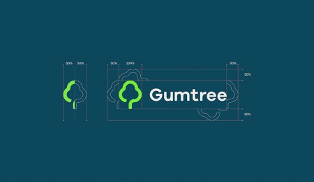
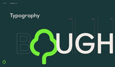
“Practically Gumtree required a logo that works at a massive range of scales from the smallest mobile screen to the largest billboard. Emotionally we wanted a tree that Gumtree could own, something that felt timeless, comfortable to all age ranges and not millennial. The result is a digital ready brand, fit for future purpose that will help re-imagine how potential users see the brand.” – Koto









Leave a Reply