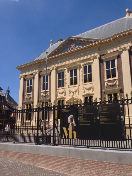
Mauritshuis is a Museum in The Netherlands. Branding was completed by Studio Dumbar.
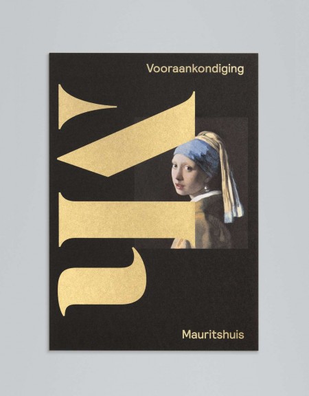
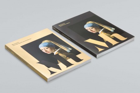
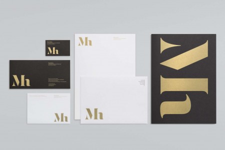
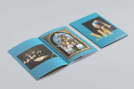
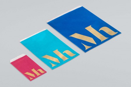
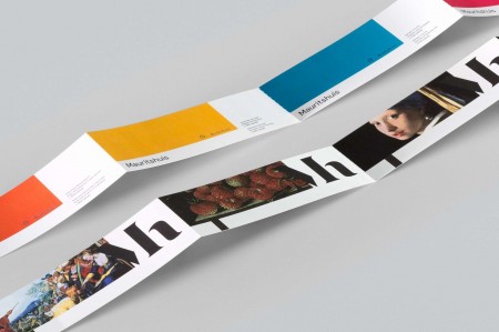
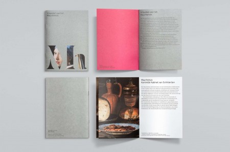
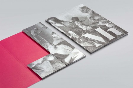
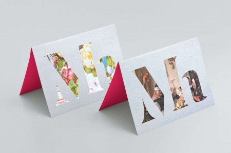
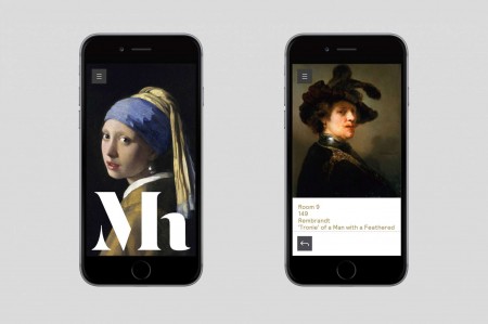
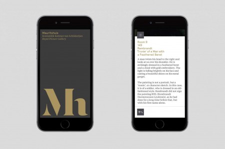
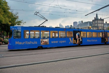
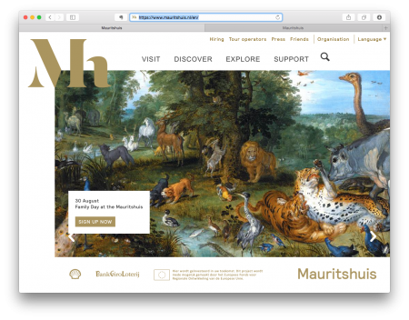
“Inspired by artists’ monograms, the new logo overlaps reproductions of key paintings to communicate a clear link between the Mauritshuis and its collection. Supported by a contemporary wordmark, the logo hints at the museum’s heritage while placing it in the 21st century. Golden Age paintings are known for their details: look closer and you’ll see more. We expressed this idea in the logo and a new photographic style: paintings are shown in context, through doorways. The core colour evokes royalty, the Golden Age and the house’s baroque interiors, while a brighter secondary palette echoes its famous damask wall coverings.” – Studio Dunbar


Leave a Reply