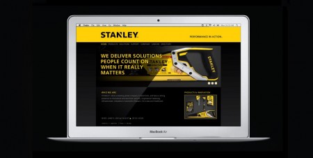
Stanley, the established tools manufacturer, is rebranding with the help of Lippincott.
Lippincott’s case study explains: “The new visual identity is grounded in Stanley’s rich heritage while simultaneously signaling the brand’s new direction. The new logo is more dynamic; it frees the Stanley name from its holding shape, yet maintains the ‘notch’ concept with an angular cut to the letter ‘N’ in the center of the word. The resulting shape is an upward arrow-like triangle that speaks directly to this concept of ‘action.’ Finally, the logo maintains the signature Stanley yellow and black palette that is universally synonymous with the brand.”


Leave a Reply