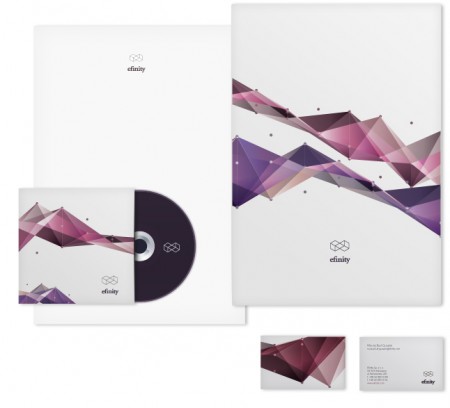
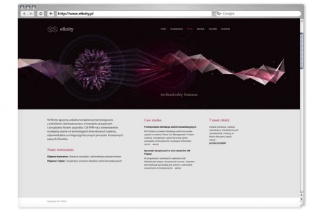
A clever take on the usual infinity symbol. This is the branding for Efinity by Helen&Co.
“Efinity is a software company behind Leadenhall.”
“The challenge was to find a solution that would subtly correspond with Leadenhall’s identity, yet remain distinctive and unique.”
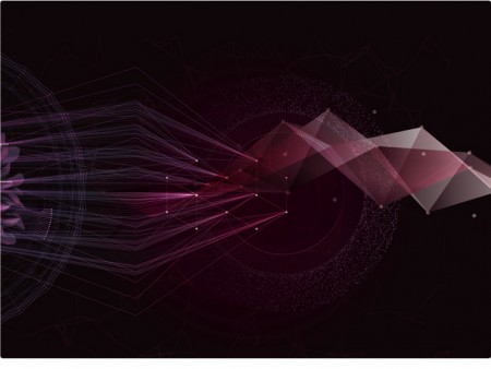
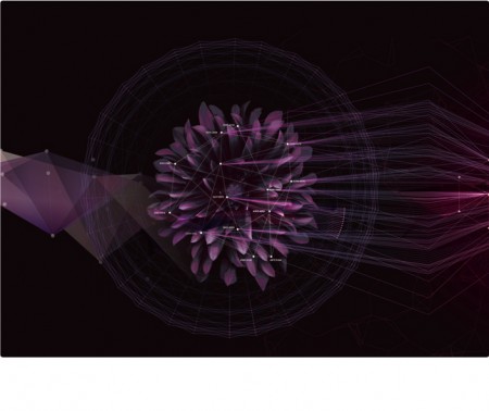
“The symbol was designed with the Ledanhall’s hexagonal grid in mind, yet applying the same pattern to imagery brought overly close resemblance to the original. For this reason the regular hexagon was politely disposed of (I’m not very good at repetition) and swapped for a ‘regular in its irregularity’ triangle. The connection between the company’s business and technology expertise was reinforced by underlining the systems found everywhere in nature, thus providing an adaptable visual system.”

Leave a Reply