We love this identity for the amazing Mama Shelter hotels. The branding work was designed by GBH London.
The following description was taken from GBH’s site:
“…the Mama brand is positioned as an ‘affordable luxury’ hotel offering a unique mix of friendliness and communality, where guests sit together at large tables enjoying hearty food like your granny used to make, or party hard together in the bar at nights. Design interiors are chic and eclectic with a drop of surreal humour and exposed concrete walls collide with graffitied blackboard ceilings and retro artefacts. The overall atmosphere is a combination of relaxed cosiness meets offbeat artist commune!
Briefed to design the identity and all touch points throughout the existing and new hotels, something memorable and unusual was required to reflect the eclectic nature of Mama .
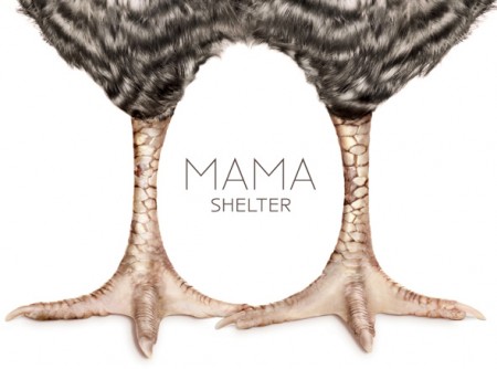
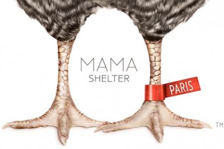
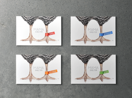
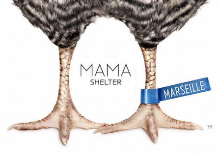
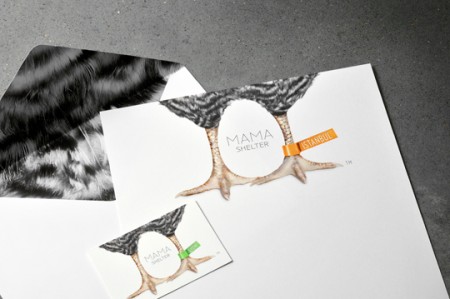
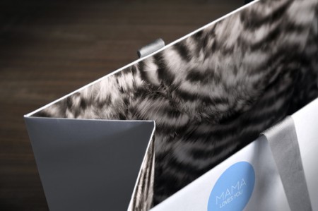
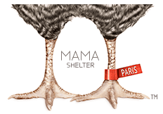
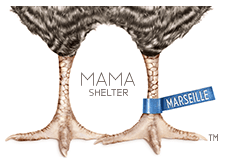
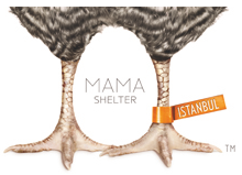
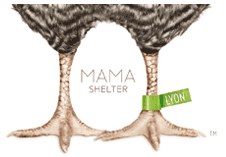
The result is a logo that is bold and unconventional, warm and cozy and plays off the name ‘Mama’. A chicken sits over the name, the negative space between its legs making the shape of an egg. Meanwhile, the hotel locations are differentiated by adding ‘leg tags’ to the logo. The logo is used sparingly within the hotel, appearing only on an iMac screen in each guest room, stationery and the occasional feather pattern used to line envelops and bags.”
Plenty of photos of the actual hotels interiors here too, which are worth checking out.
Leave a Reply