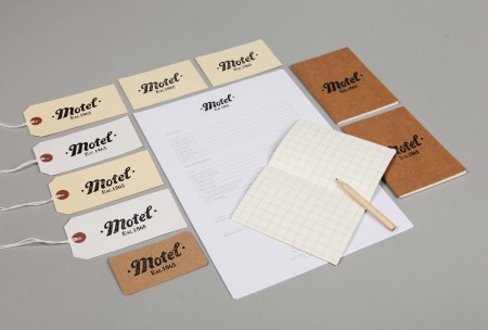
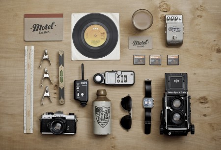
Brand identity designed by She Was Only for Shoreditch based photographic studio Motel.
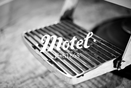
“Set in a Victorian railway arch dating from 1865, the studio asked for an identity which reflected the character of the local area.”
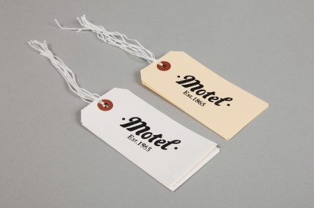
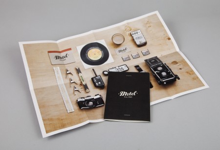
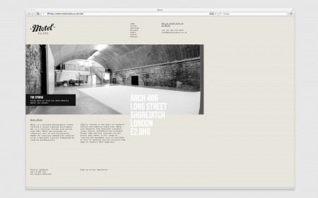
“The logotype uses a customised typeface, and was applied to stationery, business cards, and signage. The project also included a website design, and a fold out flyer for visitors.”
Leave a Reply