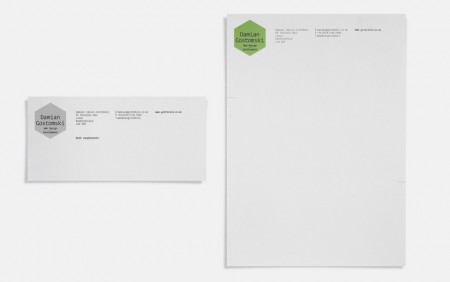
This identity for Damian Gostomski, a freelance web developer was created by James Oconnell.
James had the following to say about the branding work:
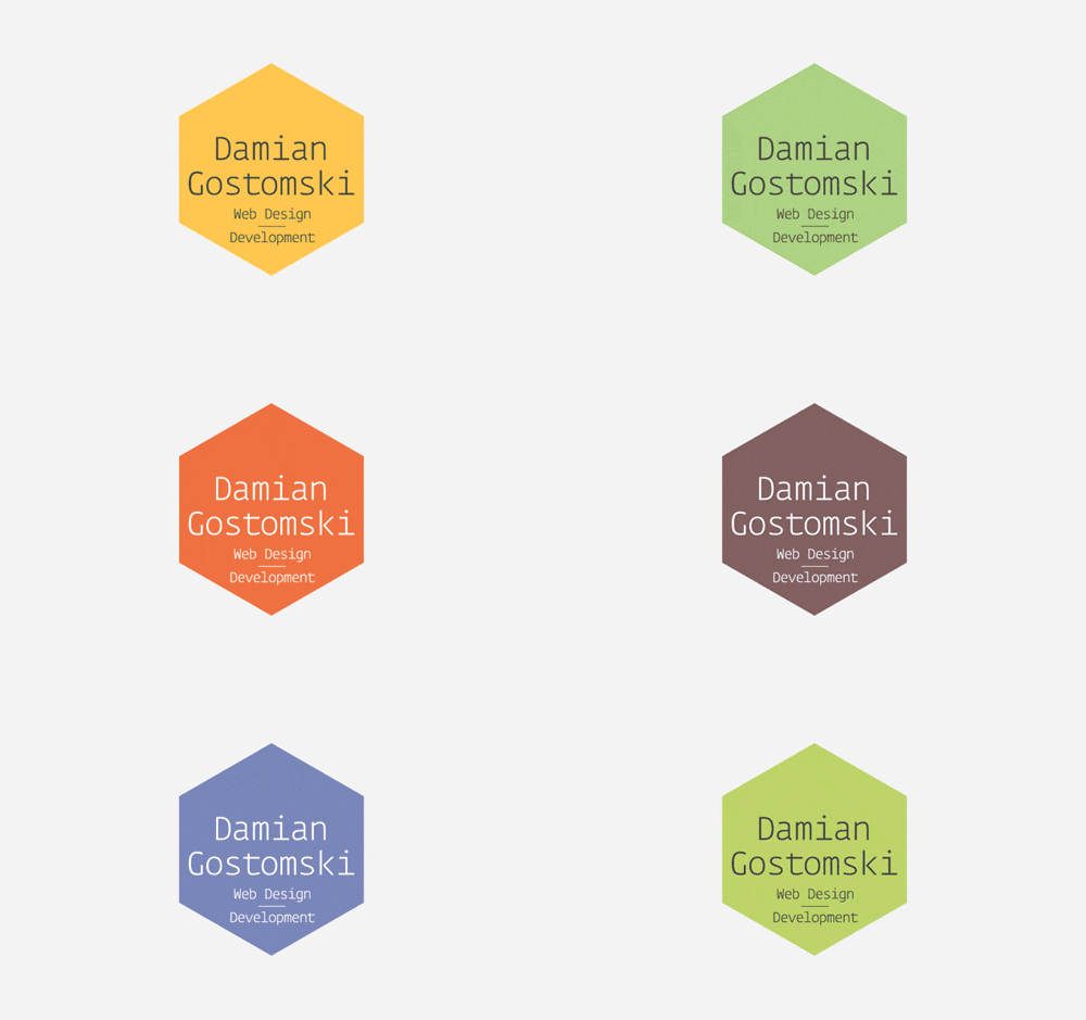
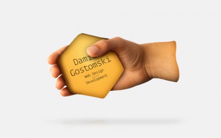
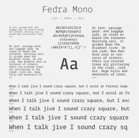
“The hexagonal shape is a form most commonly found in a beehive honeycomb, known for it’s efficient use of space and building materials. This approach lent itself immediately to how a programmer could be represented, revealing their pragmatic and somewhat tenacious methods. I began using a series of truncated equilateral triangles to create the core shape which then gave way for the main typography. Keeping the aesthetics consistent, I decided to use the ‘Fedra Mono’ typeface, for it’s slick curves and geometric tittles.
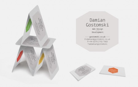
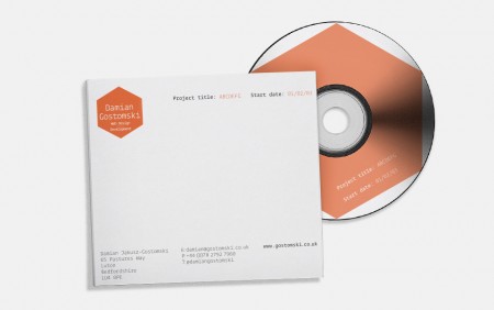
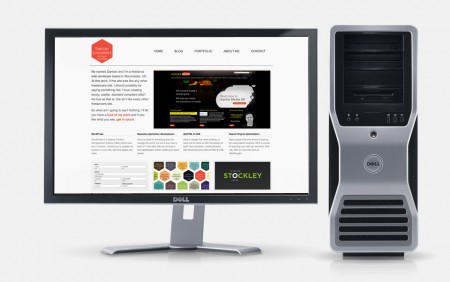
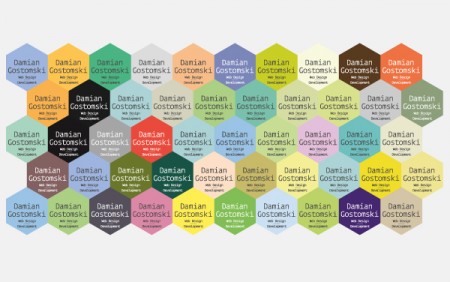
Whilst researching other programmers and their approach to branding, it became aware that the majority of sites I visited were very cold and exempt of any emotional or human touch. In light of this I wanted to create a personal system which could go hand in hand with the hexagonal approach, this lead me to producing a set palette of 50 colours which could be used across all collateral. This meant that items like the business cards and the website could apply unique colours to different sections.
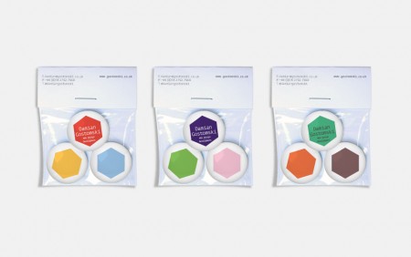
Together with the brand I also created a few promotional pieces, such as bags of badges and also a stress reliever for clients to use whilst their site is being given a helping hand by the programmer.”
Leave a Reply