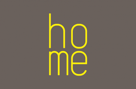
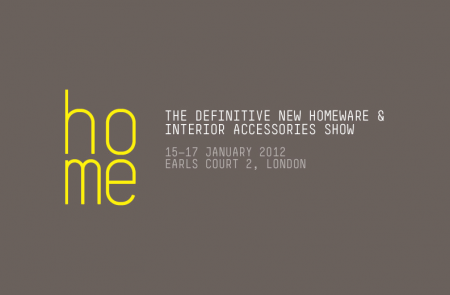
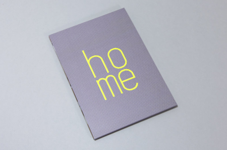
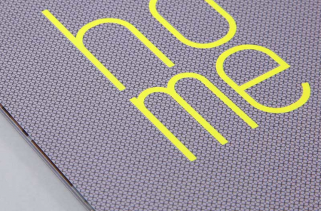
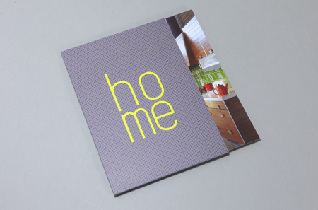
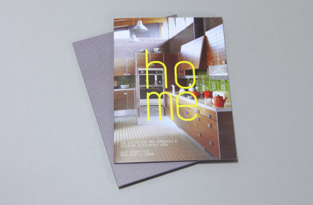
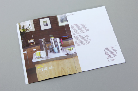
Kent Lyons did the full identity and promotional materials for the new Homewares exhibition to be held at Earls Court in 2012.
Home
by
Tags:
Comments
2 responses to “Home”
-
You could get a bus between the ‘h’ and ‘o’!
-
Matthew has a point, though it’s not the ‘h/o’ kerning that is the problem, it is the fact that this gap is different from the ‘m/e’ kerning below. The ‘o’ and ‘e’ are vertically aligned, as one would want them to be, but because the ‘h’ and ‘m’ glyphs are different widths, it just doesn’t work. Not with this font anyway. The idea isn’t too bad, but with this execution the whole logo is awkwardly off-balance. Disappointing really, more like an amateur effort or a work in progress. No offence intended to the creator, but if I’m honest, I’m surprised they got away with presenting this as a finished logo.
Leave a Reply